talk freely!...i recommend it!
Monday, June 9, 2008
Monday, April 14, 2008
Travelling Exhibition Pavilion - Zaha Hadid
A futuristic pavilion created by British Iraqi deconstructivist architect Zaha Hadid, venue for Chanel's "Mobile Art" exhibition, is built on a three-story government car park in Hong Kong February 18, 2008. Hong Kong will become the first of six international cities to exhibit the works of twenty international contemporary artists starting February 27, 2008.


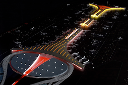
A Sneak Peek at the Bird's Nest Olimpic Stadium!
 Looks like someone sneaked in to the Beijing Olympic Stadium site at night and took some pictures to share with the rest of the world.
I went browsing through some furniture designs and this one caught my eye!..
The existing space was divided into three rooms with a false ceiling while the new design aims to restore the space back to its original proportions, which would have been as one room. The new structure was designed as a large piece of furniture to provide all the functions required by a man about town.
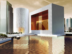
new Guggenheim-Hermitage Museum by Hadid!
 Zaha Hadid has won the competition to design the new Guggenheim-Hermitage Museum in Vilnius, Lithuania, beating Daniel Libeskind and Massimiliano Fuksas.The New York-based Guggenheim Foundation will share exhibition space with the Russian Hermitage Museum at the site, which is expected to attract up to 400,000 visitors a year, and will focus on exhibitions of new media art.A joint team will now complete a feasibility study for the Hadid scheme this summer, with the institution due to open in 2011, two years before the Guggenheim’s Abu Dhabi museum.
Friday, March 14, 2008
Zaha hadid wins the new library for Sevilla university
 Through the use of ultimate technology the spaces of the library are organized with very complicate geometric shapes which generate an architectural object in movement. Formaly it is a building with no comparison worldwide and with this choice the university will face " aditional risks because it is the first time a building with these characteristics is ever created, which will place Seville at the vanguard of architecture" asserted Bofill.
The building will size above a horizontal line parallel to the Diego de Riaño street occupying a surface of 8.000 sq meters, of which 5.000 are usefull. With a length of 130 meters it opens to the Prado Park with an uneven height with the highest point rising to 25 meters.
The building is organized in 4 levels, basement for parking, ground level for a conference room cofee shop and other public spaces, in first and second levels is a wide study room for 600 users, together with the areas of investigation.

"Both superior levels articulate around a central axis that connects to all the spaces" explaind Bofill who also indicated the sensation of movement that the building conveys. "every room is different to the others, walls and ceilings move, only floors are leveled and don't transmit that feeling" Works are expected to begin at the end of this year and be finished by 2008. She used a team of the Vasque company Idom, specialized in high end technology and who also worked in the Guggenheim de Bilbao.
 The initial budget of 10 million euros is expected to be highly increased by this design... The way this project integrates with the city differentiated it from the second prize awarded to the two Sevillian firms (Vázquez Consuegra y Cruz y Ortiz) The rupture with the architectural lines of the city defended by Zaha Hadid is "a call to Andalucia and Seville to look to the future and leave the past behind"
The aim of the new library is to promote cultural activities for the students and 3,300 researchers who use the facility and create a new focus for the University and the City of Seville. It acts as a continuation of the park, progressively rising from a soft material into a strong surface. Open areas, with panoramic views, benefit the ambiance of the building. The quieter south side of the building will be allocated for reading and the northern side is allocated for a flow of activities. On the second floor, study for students and a 600-seat lecture room are distributed across three levels. A main skylight illuminates the hall and the main triple height space of the reception hall becomes the heart of the building. The library, which Hadid says will address the new demands for more technology based university study is scheduled to open in 2008.
Thursday, March 13, 2008
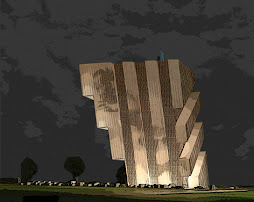
Daniel Libeskind's first completed work
The Extension to the Denver Art Museum is an expansion and addition to the existing Denver Art Museum, designed by the Italian Architect Gio Ponti. The extension will house the Modern and Contemporary art collection as well as the collection of Architecture and Design and Oceanic Art. It will also become the main entrance to the entire museum complex and will have a representative lobby with access to shops, a cafe and theater.
The project is a Joint Venture between Daniel Libeskind and Davis Partnership of Denver. The team is overseeing the construction of the project and has been based in Denver since the completion of schematics. The studio has worked closely with the director, curators, the core exhibit team, the contact architect and the Board of Trustees to realize an innovative museum for the 21st Century.
 The new building for the Denver Art Museum will be an icon whose character and form will attract a wide public to the museum complex. Nexus is conceived in close connection with the function and aesthetic of the existing Ponti museum as well as the entire Civic Center and the public library. The new building is a Nexus tying together downtown and civic center forming a strong connection to the golden triangle neighborhood. The project is not designed as a stand alone building but as part of a composition of public spaces, monuments and gateways in this developing part of the city, contributing to the synergy amongst neighbors large and intimate.
The materials of the building and plaza will be those closely relating to the existing context (local stone) as well as innovative new materials (titanium) which together will form spaces that connect local Denver tradition to the 21st Century.

The amazing vitality and growth of Denver from its foundation to the present inspires the form of new museum. Coupled with the magnificent topography with its breathtaking views of the sky and the Rocky Mountains, the dialogue between the boldness of construction and the romanticism of the landscape create a unique place in the world. The bold and forward looking engagement of the public in forging its own cultural, urban and spirited destiny is something that would strike anyone upon touching the soil of Colorado.
One of the challenges of building the Denver Art Museum is to work closely and respond to the extraordinary range of transformations in light, coloration, atmospheric effects, temperature and weather conditions unique to this city. I insist these are to be integrated not only functionally and physically, but culturally and experientially for the benefit of the visitors' experience. The conjunction of the contemporary art experience with the uniqueness of the local conditions will form part of the decisions of materials, form, and space.


The project is a Joint Venture between Daniel Libeskind and Davis Partnership of Denver. The team is overseeing the construction of the project and has been based in Denver since the completion of schematics. The studio has worked closely with the director, curators, the core exhibit team, the contact architect and the Board of Trustees to realize an innovative museum for the 21st Century.
 The new building for the Denver Art Museum will be an icon whose character and form will attract a wide public to the museum complex. Nexus is conceived in close connection with the function and aesthetic of the existing Ponti museum as well as the entire Civic Center and the public library. The new building is a Nexus tying together downtown and civic center forming a strong connection to the golden triangle neighborhood. The project is not designed as a stand alone building but as part of a composition of public spaces, monuments and gateways in this developing part of the city, contributing to the synergy amongst neighbors large and intimate.
 The materials of the building and plaza will be those closely relating to the existing context (local stone) as well as innovative new materials (titanium) which together will form spaces that connect local Denver tradition to the 21st Century.

The amazing vitality and growth of Denver from its foundation to the present inspires the form of new museum. Coupled with the magnificent topography with its breathtaking views of the sky and the Rocky Mountains, the dialogue between the boldness of construction and the romanticism of the landscape create a unique place in the world. The bold and forward looking engagement of the public in forging its own cultural, urban and spirited destiny is something that would strike anyone upon touching the soil of Colorado.
One of the challenges of building the Denver Art Museum is to work closely and respond to the extraordinary range of transformations in light, coloration, atmospheric effects, temperature and weather conditions unique to this city. I insist these are to be integrated not only functionally and physically, but culturally and experientially for the benefit of the visitors' experience. The conjunction of the contemporary art experience with the uniqueness of the local conditions will form part of the decisions of materials, form, and space.


Subscribe to:
Comments (Atom)


