talk freely!...i recommend it!


Showing posts with label Contemporary Architectures. Show all posts

Monday, April 14, 2008

Travelling Exhibition Pavilion - Zaha Hadid

A futuristic pavilion created by British Iraqi deconstructivist architect Zaha Hadid, venue for Chanel's "Mobile Art" exhibition, is built on a three-story government car park in Hong Kong February 18, 2008. Hong Kong will become the first of six international cities to exhibit the works of twenty international contemporary artists starting February 27, 2008.

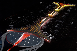
A Sneak Peek at the Bird's Nest Olimpic Stadium!

Looks like someone sneaked in to the Beijing Olympic Stadium site at night and took some pictures to share with the rest of the world.


I went browsing through some furniture designs and this one caught my eye!..
The existing space was divided into three rooms with a false ceiling while the new design aims to restore the space back to its original proportions, which would have been as one room. The new structure was designed as a large piece of furniture to provide all the functions required by a man about town.


new Guggenheim-Hermitage Museum by Hadid!

Zaha Hadid has won the competition to design the new Guggenheim-Hermitage Museum in Vilnius, Lithuania, beating Daniel Libeskind and Massimiliano Fuksas.The New York-based Guggenheim Foundation will share exhibition space with the Russian Hermitage Museum at the site, which is expected to attract up to 400,000 visitors a year, and will focus on exhibitions of new media art.A joint team will now complete a feasibility study for the Hadid scheme this summer, with the institution due to open in 2011, two years before the Guggenheim’s Abu Dhabi museum.

Friday, March 14, 2008

Zaha hadid wins the new library for Sevilla university

Through the use of ultimate technology the spaces of the library are organized with very complicate geometric shapes which generate an architectural object in movement. Formaly it is a building with no comparison worldwide and with this choice the university will face " aditional risks because it is the first time a building with these characteristics is ever created, which will place Seville at the vanguard of architecture" asserted Bofill.

The building will size above a horizontal line parallel to the Diego de Riaño street occupying a surface of 8.000 sq meters, of which 5.000 are usefull. With a length of 130 meters it opens to the Prado Park with an uneven height with the highest point rising to 25 meters.

The building is organized in 4 levels, basement for parking, ground level for a conference room cofee shop and other public spaces, in first and second levels is a wide study room for 600 users, together with the areas of investigation.


"Both superior levels articulate around a central axis that connects to all the spaces" explaind Bofill who also indicated the sensation of movement that the building conveys. "every room is different to the others, walls and ceilings move, only floors are leveled and don't transmit that feeling" Works are expected to begin at the end of this year and be finished by 2008. She used a team of the Vasque company Idom, specialized in high end technology and who also worked in the Guggenheim de Bilbao.
The initial budget of 10 million euros is expected to be highly increased by this design... The way this project integrates with the city differentiated it from the second prize awarded to the two Sevillian firms (Vázquez Consuegra y Cruz y Ortiz) The rupture with the architectural lines of the city defended by Zaha Hadid is "a call to Andalucia and Seville to look to the future and leave the past behind"

The aim of the new library is to promote cultural activities for the students and 3,300 researchers who use the facility and create a new focus for the University and the City of Seville. It acts as a continuation of the park, progressively rising from a soft material into a strong surface. Open areas, with panoramic views, benefit the ambiance of the building. The quieter south side of the building will be allocated for reading and the northern side is allocated for a flow of activities. On the second floor, study for students and a 600-seat lecture room are distributed across three levels. A main skylight illuminates the hall and the main triple height space of the reception hall becomes the heart of the building. The library, which Hadid says will address the new demands for more technology based university study is scheduled to open in 2008.

Monday, January 28, 2008

Nanyang School of Art, Design and Media


Nanyang School of Art, Design and MediaThe new iconic School of Art, Design and Media is situated in a wooded valley right in the heart of the campus. The design was conceived as 3 intertwining blocks that are apparent natural extensions of the ground. These blocks interweave to enclose a picturesque plaza and landscape. Major spaces such as the Auditorium, Media Studios, library and art galleries surround this outdoor activity node.Tucked indoors are complementary facilities such as Stop Motion Studio, 3-D Hi-End Computer Graphics Studio, Soundstage, Sound Recording Studios, Audio Visual Editing Suites, Hi-End Digital Post Studio etc.


I just love the way the roof blends with the enviroment..its kinda healthy too! won't have to jog at the nearest park..just the roof will do!
I should have mentioned it is designed by the CPG Corporation.The below text is taken from DesignFluteThis is a 5-storey School of Art, Design & Media at Nanyang Technological University campus, Singapore. This stunning piece of award-winning architecture is situated in a wooded valley. Before you read on, answer this : is this a landscape or a building?


The embracing arms of this unique building have a most spectacular verdant turfed roof which blends with ground contour as if emerges from it. It has glass curtain wall and raw concrete minus the painting.Apart from its visual impact, the turfed roofscape helps to lower the roof temperature and surrounding areas. It works as a functional space, as a scenic outdoor community space via easily accessible sidesteps along the roof edge.The building design challenges the traditional linear system of education with a clear teacher-student arrangement. Here, given the sloping nature of the architectural form, many of the teaching spaces come in different shapes and volumes which could be easily adapted to different needs. For example corridors and cozy corners double up as informal exhibition areas. The architectural form beautifully complements and creates an ambience and environment conducive for exploration and exchange of ideas for the arts and design students.

Beijing CCTV (almost finish!) OMG!

view of the building from the bottom..


view of the building from a far..


the Beijing CCTV is now taking its true form. its amazing! breath-taking! no words can discribe its concept except juz rule-breakingly breathtaking...i juz cant wait for its grand opening just b4 the Olimpics this year..more pics of the Beijing CCTV is coming soon guys! don't worry!

these are the steel used on its facade..its a pity the amount of steel that was need..its juz too much!

Thursday, January 17, 2008

When did buildings started to be named after architects!?


Fascinatingly the newspaper continues calling Libeskind a ‘superstar’. The cherishing of the designer goes so far that the developer has called it the ‘L-tower’, the Libeskind-tower. That is not all new; in the new business district in the south of Amsterdam there is already the ‘Ito-tower’ (Toyo Ito) and the ‘Viñoly-tower’ (Rafael Viñoly). Architects are increasingly celebrated, it seems. For architecture, that is not bad at all, even Nicolai Ouroussoff has recently realized.
The L-tower is not the most typical work of Daniel Libeskind. Gone are the crisscross lines on turned rectangular volumes, we are familiar with from the architect. Here the ruler has been displaced by a pair of compasses. A massive curve descends from the top of the condo-stack at 205 meters above Toronto all the way down onto the cultural center in the plinth of the building. Another curve forms a round-round arch as a centerpiece of the project.
It looks like… a boot, yes. The arch, and the ‘slendering’ of the tower-volume at that ‘heel’ formally support this image. What also helps is that the lower part of the project has a slightly different texture – no puncturing balconies, and increased floor-to-floor height.
While the tower houses 480 condo’s, this plinth building is meant as a ‘colleague’ to the old theater-building that stands right next to this new project. “If fundraising permits, the podium will house an interactive cultural and artistic arts lab, with a wide range of facilities”, newspaper The Star notes.
Personally I would have expected the entrance of the cultural center right in the middle of the arch, at street level, but curiously all one finds there are the doors to the expedition of the podium of the theater behind. Ironically, it is where the boot lifts from the ground visitors enter the cultural center.
It also looks like the ‘boot’ is lifted only shortly before it could crush a piece of the old building. Not a very positive metaphor either. A little more distance to old building would have made the difference, I think. This is a jam-packed sheme.
“First occupancy of the tower has been given the rather specific date of November 30th 2010 and penthouses will cost up to 2.5 million Canadian dollars”, Skyscrapernews sarcastically
writes. Maybe precise, but not a very tight schedule, that is three years from now!

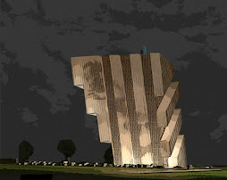
Curly Slabs_Oppenheim


To resist the cliché of crisscross bridges between the slabs, and instead flatten that image into two surfaces, is just magnificent. The homerun is made with the terrific dialogue of the crisscross strips with the trees down below on the ground.

The idea of slabs that bend and blend at its bottom isn’t that new. Anarchitecture last fall showed a huge Modernist project in Vienna that tries to fold into the earth with terrace housing. And a firm like BIG has projects like that all the time. What fascinates me though at this project by Oppenheim for an undisclosed location in the United Arab Emirates is that the starting point is the good-old slab.

The abstract Modernist slab, with its inherent economy of building, is here only slightly morphed for maximum effect. Like the other work of Oppenheim it is slick. And it remains very two dimensional, like the slabs of Le Corbusier. The surface with crisscross lines at the inside emphasized this thinness of the surfaces. Whereas the curveous objects of BIG are always three-dimensional.

Thursday, December 27, 2007

Zaha Hadid Want it Done Her Way....bitch!


Zaha Hadid makes a mark! the OPUS project unveiled in London

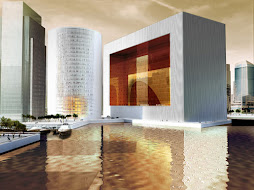
Zaha Hadid has unveiled a dramatic proposal for the Business Bay area of Dubai. The masterplan had called for two towers but Zaha’s loose interpretation takes the form of a huge sculptured cube. During the press conference it was apparent that client Omniyat Properties had asked Zaha to design the interior of another project but she had refused as she couldn’t do it her way. Even the conference itself was held in London to accommodate the glamorous architect, with many of the press flying in from Dubai to attend the launch.

The Opus project will be fringed by the Burj Dubai development. it will be neighbours with the Dubai International Financial Centre and the World Trade and Convention Centre, giving it a presitgious location with excellent access to the city. The Opus will appear to hover from the ground. Constructed of three separate towers the building will appear as a singlular unified whole, with a distinctive void. The interiors of which will be clad with a fully engineered curved class curtain wall to allow for eye-catching views into the void.


Reflexive fritting patterns in the form of pixilated striations will be applied onto the glass facade to provide a degree of reflectivity and materiality to the cube while assisting in the reduction of solar grains inside the building. Within the Opus there will be a retail podium across the ground, first and second floor. The uppermost floor will feature a tranquility zone, a beach deck with a reflective pool and shaded roof terrace, a media zone and a gym. The building boasts an AAA-class rating and has 87 per cent space efficiency. The project will be launched at Citiscape property exhibition in Dubai in October 2007.

Monday, December 24, 2007


Probably one of the most incredible buildings i've ever seen, even on renderings. Im really looking forward to see this building completed.

This was taken on April 2nd, 2007..
and this on December, 2007!

The new site of CCTV is located to the east of East Third Ring Road, north of Guanghua Road, south of Chaoyang Road and within the CBD. The new site of CCTV covers a total area of 187,000 sq.meters. The total floorarea is about 550 thousand sq. meters. The tallest building will be about 23O meters and the total investment for the project will be about RMB 5 billion.

It has been determined that the new site of CCTV will apply the design scheme of OMA from the Holland. Experts say that the scheme will not only establish the image of CCTV, but also turns to a new page for China's architecture circle.