talk freely!...i recommend it!


Monday, January 28, 2008

Nanyang School of Art, Design and Media


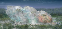
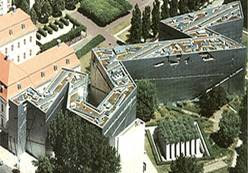
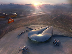
Nanyang School of Art, Design and MediaThe new iconic School of Art, Design and Media is situated in a wooded valley right in the heart of the campus. The design was conceived as 3 intertwining blocks that are apparent natural extensions of the ground. These blocks interweave to enclose a picturesque plaza and landscape. Major spaces such as the Auditorium, Media Studios, library and art galleries surround this outdoor activity node.Tucked indoors are complementary facilities such as Stop Motion Studio, 3-D Hi-End Computer Graphics Studio, Soundstage, Sound Recording Studios, Audio Visual Editing Suites, Hi-End Digital Post Studio etc.


I just love the way the roof blends with the enviroment..its kinda healthy too! won't have to jog at the nearest park..just the roof will do!
I should have mentioned it is designed by the CPG Corporation.The below text is taken from DesignFluteThis is a 5-storey School of Art, Design & Media at Nanyang Technological University campus, Singapore. This stunning piece of award-winning architecture is situated in a wooded valley. Before you read on, answer this : is this a landscape or a building?


The embracing arms of this unique building have a most spectacular verdant turfed roof which blends with ground contour as if emerges from it. It has glass curtain wall and raw concrete minus the painting.Apart from its visual impact, the turfed roofscape helps to lower the roof temperature and surrounding areas. It works as a functional space, as a scenic outdoor community space via easily accessible sidesteps along the roof edge.The building design challenges the traditional linear system of education with a clear teacher-student arrangement. Here, given the sloping nature of the architectural form, many of the teaching spaces come in different shapes and volumes which could be easily adapted to different needs. For example corridors and cozy corners double up as informal exhibition areas. The architectural form beautifully complements and creates an ambience and environment conducive for exploration and exchange of ideas for the arts and design students.

Beijing CCTV (almost finish!) OMG!

view of the building from the bottom..


view of the building from a far..


the Beijing CCTV is now taking its true form. its amazing! breath-taking! no words can discribe its concept except juz rule-breakingly breathtaking...i juz cant wait for its grand opening just b4 the Olimpics this year..more pics of the Beijing CCTV is coming soon guys! don't worry!

these are the steel used on its facade..its a pity the amount of steel that was need..its juz too much!

Thursday, January 17, 2008

When did buildings started to be named after architects!?


Fascinatingly the newspaper continues calling Libeskind a ‘superstar’. The cherishing of the designer goes so far that the developer has called it the ‘L-tower’, the Libeskind-tower. That is not all new; in the new business district in the south of Amsterdam there is already the ‘Ito-tower’ (Toyo Ito) and the ‘Viñoly-tower’ (Rafael Viñoly). Architects are increasingly celebrated, it seems. For architecture, that is not bad at all, even Nicolai Ouroussoff has recently realized.
The L-tower is not the most typical work of Daniel Libeskind. Gone are the crisscross lines on turned rectangular volumes, we are familiar with from the architect. Here the ruler has been displaced by a pair of compasses. A massive curve descends from the top of the condo-stack at 205 meters above Toronto all the way down onto the cultural center in the plinth of the building. Another curve forms a round-round arch as a centerpiece of the project.
It looks like… a boot, yes. The arch, and the ‘slendering’ of the tower-volume at that ‘heel’ formally support this image. What also helps is that the lower part of the project has a slightly different texture – no puncturing balconies, and increased floor-to-floor height.
While the tower houses 480 condo’s, this plinth building is meant as a ‘colleague’ to the old theater-building that stands right next to this new project. “If fundraising permits, the podium will house an interactive cultural and artistic arts lab, with a wide range of facilities”, newspaper The Star notes.
Personally I would have expected the entrance of the cultural center right in the middle of the arch, at street level, but curiously all one finds there are the doors to the expedition of the podium of the theater behind. Ironically, it is where the boot lifts from the ground visitors enter the cultural center.
It also looks like the ‘boot’ is lifted only shortly before it could crush a piece of the old building. Not a very positive metaphor either. A little more distance to old building would have made the difference, I think. This is a jam-packed sheme.
“First occupancy of the tower has been given the rather specific date of November 30th 2010 and penthouses will cost up to 2.5 million Canadian dollars”, Skyscrapernews sarcastically
writes. Maybe precise, but not a very tight schedule, that is three years from now!

Curly Slabs_Oppenheim


To resist the cliché of crisscross bridges between the slabs, and instead flatten that image into two surfaces, is just magnificent. The homerun is made with the terrific dialogue of the crisscross strips with the trees down below on the ground.

The idea of slabs that bend and blend at its bottom isn’t that new. Anarchitecture last fall showed a huge Modernist project in Vienna that tries to fold into the earth with terrace housing. And a firm like BIG has projects like that all the time. What fascinates me though at this project by Oppenheim for an undisclosed location in the United Arab Emirates is that the starting point is the good-old slab.

The abstract Modernist slab, with its inherent economy of building, is here only slightly morphed for maximum effect. Like the other work of Oppenheim it is slick. And it remains very two dimensional, like the slabs of Le Corbusier. The surface with crisscross lines at the inside emphasized this thinness of the surfaces. Whereas the curveous objects of BIG are always three-dimensional.

Monday, January 7, 2008

top 10 reasons why to date an architect

1. all night long, all night strong.
2. we are damn good with our hands.
3. if we can commit to chipboard, relationships should be easy.
4. you should see the things we errect.
5. use to doing things over and over again.
6. finishing early never happenes.
7. we know the true meaning of interpretation
8. creative positioning.
9. work well in groups
10. entry and passage are always exciting.
______________________________________________________
WWMD.........."what would mies do?!"

College Starts Now!

Dang...that was a long wait! finally classes started. I was bored out of my mind. well, as i would've known, i was bombarded with tons of assignments...again! this time, its regardin the Contract Conditions with a group of 4 to 5 dued in March. it includes a presentation and the whole works. now...what's next...ah...oh ya! the last assignment of Western History..im not sure what is supposed to be done though..all i know is that it involves a group and presentation. next is the hardest, i have to design a Tourism Information centre in Sibu. The Location and the works. the contemporary design of the facade has to be incordances with the surrounding environments and buildings and....

Sigh...Well, i gotta go...there's alot of work to be done..i'll be kinda buzy so don't expect anythin in the near future (until CNY that is!) but i'll try my best!