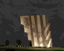
To resist the cliché of crisscross bridges between the slabs, and instead flatten that image into two surfaces, is just magnificent. The homerun is made with the terrific dialogue of the crisscross strips with the trees down below on the ground.
The idea of slabs that bend and blend at its bottom isn’t that new. Anarchitecture last fall showed a huge Modernist project in Vienna that tries to fold into the earth with terrace housing. And a firm like BIG has projects like that all the time. What fascinates me though at this project by Oppenheim for an undisclosed location in the United Arab Emirates is that the starting point is the good-old slab.
The abstract Modernist slab, with its inherent economy of building, is here only slightly morphed for maximum effect. Like the other work of Oppenheim it is slick. And it remains very two dimensional, like the slabs of Le Corbusier. The surface with crisscross lines at the inside emphasized this thinness of the surfaces. Whereas the curveous objects of BIG are always three-dimensional.


No comments:
Post a Comment